Tips on Making Your Display Stand Out at Craft Shows and Vendor Events! 8
When you are participating in a craft show or vendor event, you really want to make YOUR products and YOUR displays stand out. Keep in mind there will be a LOT of other people there with other products and as customers gaze from one vendor table to the next, you want to create a display that STOPS people in their tracks and causes them to come and look closer at what YOU have to offer!
Before people even realize WHAT your product is, they are drawn to what your entire display, table or booth looks like. Not the actual product itself. So when setting up your table or booth, be sure to step back away from it and look at it from the customers point of view. Ask yourself, "would this display make ME want to stop and take a closer look?"
One of the best ways to accomplish this is to make sure you keep things simple. Don't add too many props within your display or on your table, that from a distance, it makes it hard to see what it is you are even offering! Adding props is ok, but make sure they have a cohesive look throughout your display.
If you products are full of color or your product packaging has a lot of color in it, utilize displays and props that are solid in color to ensure that your products stand out. If your products do not have a lot of color or are made with solid color packaging, this is where utilizing displays with color or designs can really make your products POP!
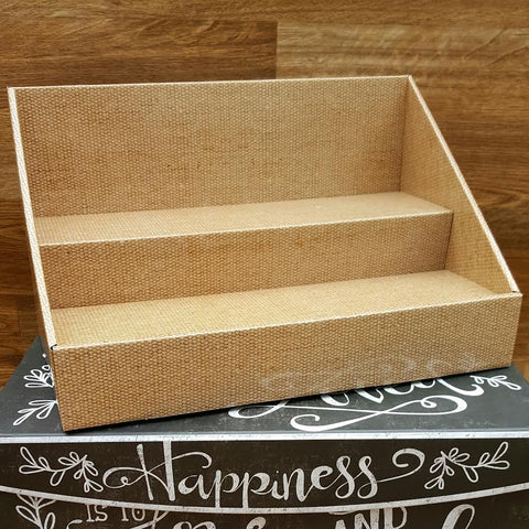
If you are displaying a LOT of products and carry a lot of inventory, don't display too much at once. If you have a lot of inventory on your table, make sure that it is neatly displayed. Utilize shelves or tiered displays to give the products height. It will also make it look more like a retail display and will give it a more professional look.
If you do not have a lot of inventory, that's ok too! Use stand up signs to explain your product which will take up more space on your table. Take pictures of your product, have them blown up into larger pictures, then have them laminated, which makes them easier to display. You can do this for just a few dollars at your local office supply store!
ALWAYS have a banner with the name of your business! It doesn't need to be fancy. But it DOES need to have a professional look! Don't fill up your banner with too much information or over do it with too may pictures! Keep it simple! If you are utilizing a service like VistaPrint, or any other banner making services, just make sure you upload a file that is high resolution, to ensure your banner is printed with clear graphics!
Take the time to put some thought into what your display looks like. If you are serious about selling your products, the visual impression you make is key to selling your products!
- Stack Displays
- Tags: craft show displays craft show ideas product display ideas vendor booth ideas vendor tables
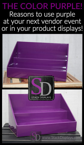
Using PURPLE in Your Product Displays or Vendor Booth 0
DOES COLOR REALLY MATTER?
YES!!! Color affects human behavior, so keep this in mind when utilizing it in your displays. Companies use specific colors in their branding to evoke a response or to give a certain impression. What type of impression are YOU trying to give? What kind of response do YOU want when people see your products or walk by your booth? Understanding how colors work and how to utilize them is key in creating the perfect product display! Your success depends upon how you use it!
PURPLE, PURPLE AND MORE PURPLE!
First and foremost, purple is considered to be one of the most calming colors. It is a combination of the warmest and coolest of colors (red and blue), thus creating a sense of calm and spiritual comfort. It is kind of like the Ying and Yang of colors! Rich shades of purple, however, give a sense of royalty. When used with a product, it gives a sense of high quality and makes the product feel more luxurious.
PURPLE FROM A VISUAL PERSPECTIVE.
Purple is visually powerful. It draws people in. Imagine two vendor booths set up next to each other. One has no dominant color palette and the other is beaming with rich hues of purple! Which would YOU more likely be drawn to? Probably the one with purple. There is just something magical about purple! It gives you a sense that the products are of higher quality. It draws you in out of curiosity and makes you want to find out more.
LET'S TALK QUALITY.
As we said, purple makes a product appear that it is higher in quality. It adds value and makes you feel as though what you are offering is 'worth it". Even if your products themselves are not packaged in purple, display them on something that is. The response will be the same. Purple simply makes things look so much richer and more elegent!
USING PURPLE TO GET A MESSAGE ACROSS.
Purple will grab your attention. Are you trying to get someone to join your Team? Use purple to relay that message! Purple is also associated with leadership and revenue! Lead with purple and they will come! Purple is associated with success. It will give people the impression that you are either already successful, or are on a journey to become successful!
TIPS ON USING PURPLE IN YOUR PRODUCT DISPLAY OR VENDOR BOOTH.
1.) A rich shade of purple can stand on its own. You don't need to add a lot of extra design elements to get your point across. Let the color work its magic on its own! Small amounts of design elements are ok, but be careful not to undermine the power of the color.
2.) Although purple is considered an extremely calming color, too much purple can be overwhelming and confusing. It can overstimulate your senses. A good rule of thumb when using large amounts of purple is to balance it out with shades of black, greys and white.
3.) Purple is definitely associated with having a bigger affect on women, more than men, but that is starting to change. I like to compare it to men who aren't afraid to wear pink. Today, it's almost a sign of confidence for a man to wear a bright shade of pink! Now they are also including shades of purple, as well!
4.) If you are using different props or fabrics in your display with different hues of purples, MAKE SURE THEY ARE COMPLIMENTARY HUES! Using colors that do not coordinate well with each other will ruin the whole impact of using purple. It will be confusing visually and will diminish the richness of the color. This concept can be carried over to the use of ANY color in a vendor display. Using shades of colors that are not complimentary will make your display look cheap! If you aren't sure which shades to use, take some time to look it up on the internet, or get ideas from Pinterest! There are SO many pictures on Pinterest about colors and design!

- Stack Displays
- Tags: jamberry product display ideas purple purple displays scentsy stack displays vendor booth ideas younique
Looks are EVERYTHING!!! The hard truth about setting up a vendor display booth. 1
Think about it.....
A person is walking through a busy vendor show, they only have a certain amount of time to visit as many vendors as possible. Which vendor booths will they take the time to stop at and why?
I don't care what you sell or how great your product is. People will stop at the booths that are visually appealing 1st, then what product you sell will be the 2nd reason a person visits your booth.
Want to pull people in that may not have thought about purchasing your product before? Make your booth look AMAZING! Give them a reason to enter your "product world" by creating a look and feel that they can't resist being a part of! Visual attractiveness will pull people in. It makes people curious. Even if they have never heard of your company, if they are visually attracted to your display, they will walk into your space to "find out" what it is you sell!
So what if you don't set up in a booth "space" and only have a 6 or 8 foot table to utilize to capture people's attention? GREAT! That's less work for you, but be CREATIVE! There are ways to utilize a small space to still give it that "wow factor"! Just don't over-do it! In a small space, less is definitely more! Give your display a clean, professional look.
Don't set up your booth from the inside out. Set it up from the outside in! I know, I know......that sounds weird, but what it means is this: Set up your booth always imagining yourself as a potential customer looking in to your booth. Imagine what THEY are seeing as they walk by. Ask yourself, "would I want to stop by this booth?"
How you set up your booth, table and product displays is essential to your success! Looks really ARE everything!
Check back to read our next blog post on more specific tricks and ideas to really making your vendor booth or table stand out!!!
#vendordisplays #vendorboothideas #craftshowideas #craftshowbooth #vendortableideas #stackdisplays
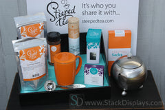
Vendor Booth Ideas for Setting Up Product Displays - by Stack Displays.com 0
Setting up a vendor display with your products doesn't have to be difficult! Just remember it's always better to keep it simple! Too many props or "extras" on your display table can distract people from your products! Always display your products utilizing different heights so that your customers can easily see your products. If your products or product labels have many different colors, then your display props should not! Always use coordinating colors that are pleasing to the eye! #vendorevents #productdisplays #displayideas #vendorshows
#stackdisplays